We specialize in Strategy, Positioning, Naming, marketing, Branding, Packaging, merch, copywriting, web design, social media and interior design.
Industries we love to work in are food/bev, cpg, dtc, music/record label, beauty/wellness, cannabis, pets and more!
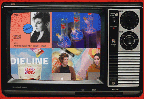
How Studio Linear Is Defining Cannabis Brand Design
Interview with The Dieline
Slowly but surely, cannabis advocates have chipped away at laws prohibiting the sale and consumption of weed. As of this writing, there are only four US states where it remains completely illegal, but recreational and medicinal exist in some form throughout the rest of the country.
With the rise of legal markets—on a state level anyway—the need for professionally designed brands came. Packaging would need to comply with rules that vary from state to state, in addition to doing the usual packaging things like protecting the product and swaying consumers to buy with expertly crafted branding.
To be sure, being able to shop for herb without risking landing in the Greybar Hotel is a landmark. However, from a branding standpoint, watching the evolution of the legal cannabis market has been exciting. Studio Linear is a design agency that is defining, in real-time, how to dream up cannabis brands. Helmed by founder Andrea Beaulieu, Linear’s approach evolves from the proto-stoner aesthetic, and, more importantly, their work raises the bar for what’s possible within the category, particularly when it comes to the look-alike approach of earlier cannabis branding.
Of course, Beaulieu and her studio didn’t set out to be cannabis experts. Andrea’s education and professional background are in music and horticulture, and Linear mostly worked with musicians and beverage brands. But as inquiries from cannabis brands came in, Beaulieu began to consider it and research things like related packaging regulations and saw an opportunity to elevate the emerging category.
“What I love about cannabis is that the clients are really open-minded,” Andrea says. “In the beginning, getting clients to pivot from that stoner, tie-dye look was a little bit of a challenge. Convincing clients that cannabis can be much more than that was a challenge. That was what excited me most about cannabis, that I could see that pivot happening. And I think we got into the industry at a perfect time.”
NY-based Florette is a brand with a distinctive cannabis feel without relying on obvious stoner references and tropes. The brand name is a subtle nod to the product, as “flower” is everyday slang for cannabis. The typography has a 70s feel, a period of peak cannabis culture, but again, Florette’s approach is nuanced. Like so much of the agency’s work, Florette has a universal appeal that doesn’t silo consumers based on desired effect or lifestyle. Florette’s branding also doesn’t copy “wellness” cues with an emphasis on functionality. Instead, Florette’s packaging looks more like an everyday brand that elegantly slips into a consumer’s everyday life.
The availability and overall acceptance of cannabis have provided an opportunity for products in this space to break away from being defined simply by stoner culture and be more reflective of the broader consumer base. This change in cannabis perception allows brands like Florette to blossom with an identity based on its multigenerational operation, care in cultivation, and inclusiveness. Alien heads and big pot leaves might appeal to the dishwasher picking up a sack to smoke later behind the dumpsters with the cute servers, but it doesn’t speak to those smoking “dog walking” joints or 5mg gummies to help catch some sleep.
Part of Linear’s approach to defining cannabis branding is through captivating and unique typography. Fluid, organic shapes used for Sweedles’ Mood Rings or Glazed’s wordmark feel like cannabis without screaming pot. Sweedles offers low-dose gummies that combine wavy type with bright gradients to create a nostalgic, psychedelic look that makes it fun while not overtly cannabis. Pragmatically, the focus on type and color avoids running afoul of packaging rules and the perception that mood rings are attractive to children.
Glazed’s typography has interesting, varying widths that are elegant and, on closer look, seem similar to whisps of smoke, or in the case of the “L” in “Glazed,” a bong. Combined with photography of flowers and picnics, Glazed is visually tranquil and portrays the heightened state of mind one would expect after using the product.
Andrea’s botanical background is also evident in Linear’s cannabis work. Flowers, plants, and nods to vintage botanical illustrations can be seen on projects like Le Feuille, Flora And Fauna CBD, and Glazed. For example, Flora and Fauna CBD’s branding is a trip through a lush garden full of large flowers and leaves. Though a wellness brand, Flora and Fauna’s branding conveys more of a serene feeling than communicates the benefits directly. Le Feuille, which means “the leaf” in French, makes CBD with herbal blends that create unique mood enhancers. Using bouquets of flowers prominently throughout serves as a nod to Le Feuille’s CBD, herbal blends, and cannabis generally. Flower bouquets are generally mood lifters and bring joy; Le Feuille’s branding makes excellent use of this fact.
Andrea’s understanding and passion for horticulture are evident in how Linear presents cannabis. Most of us know little about cannabis as a plant or plants in general, but botany proved endlessly fascinating to the designer. In the end, cannabis might open our minds and change our perceptions, but it is a plant with a solid connection to nature and the earth. “A lot of what I love about horticulture is the design and the old vintage style,” Beaulieu says. “I love being able to take plants and create a design with them. With a horticulture background, cannabis was a natural shift for me because it was already something that I loved. I already felt it was a big part of my life. And so it felt like a really natural fit for Linear.”
In many ways, cannabis is feminine. It’s the female cannabis plants that produce the buds we consume, for example. Being female-led and owned, Linear has a strong feminine undercurrent that carries it and also attracts female-led cannabis clients. With cannabis branding in its early stages, the participation of more women in the market, from business founders to women-led studios like Linear, brings some feminine energy to the industry. Studio Linear isn’t only female-led, but nearly all-female team.
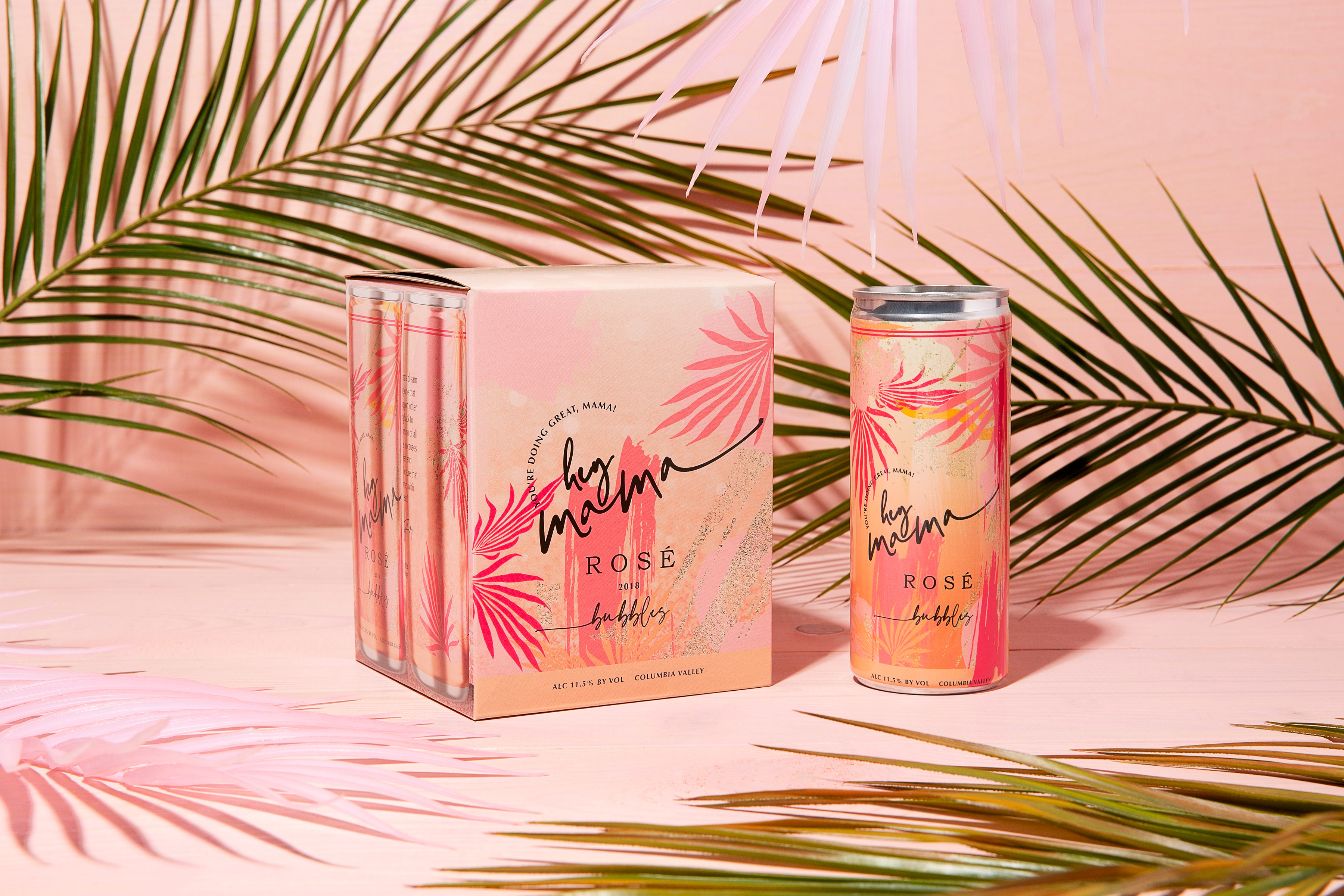
You can also find that female synergy in projects like Hey Mama Wines. The packaging is bright and fun and resonates with moms looking to unwind with a can of wine. The combination of bright hues and tropical foliage, along with the playful type, evokes a leisurely day lounging by the water, even if the occasion is a binge-watch on the couch.
“Being female-led definitely makes a huge impact on the work that we do,” says Jacqueline Cooke, creative and brand director at Studio Linear. “It attracts a lot of female clients. And there’s this baseline of understanding between us and our clients, which is always great. We have some wonderful men that we work with as well, of course. It can sometimes be a little bit more challenging navigating the business world as a woman, so having that baseline understanding is a positive.”
Studio Linear isn’t stopping at branding and packaging design, either. Linear has started interior design for plant medicine and cannabis dispensaries and consumption lounges. As with previous cannabis work, Linear’s approach departs from typical stoner interior design tropes like UV posters, beanbags, and beaded doorways. Nor are the spaces trying to copy Apple stores or other types of interiors, either. Instead, Linear Spaces designs interiors to provide a premium experience akin to a fancy night out.
“People don’t want to be sneaking around. They want an elevated experience that they would have at a beautifully designed bar, out to dinner, or something similar,” Cooke says. “For companies investing in physical spaces, it’s about marrying their digital and physical presence and making sure that those brand touch points are super strong all the way through.” The changing legal and social state of cannabis has brought with it a shift in how we define and perceive it. Cannabis is something many Americans can now tack onto a grocery list with eggs, milk, and butter (though you still can’t buy it at a grocery store, at least not yet).
Studio Linear’s approach to branding cannabis moves pot outside of the pothead aesthetic. More importantly, Linear’s cannabis branding is helping to trailblaze a new identity for the cannabis category itself. Brands like Florette and Glazed don’t look like stoner brands, and they aren’t trying to look or feel the holistic mindful juice brand of the week, either. There’s a unique cannabis identity budding, and Linear has a hand in nurturing it.
.png)
.png)
.svg)


.webp)


.svg)