We specialize in Strategy, Positioning, Naming, marketing, Branding, Packaging, merch, copywriting, web design, social media and interior design.
Industries we love to work in are food/bev, cpg, dtc, music/record label, beauty/wellness, cannabis, pets and more!
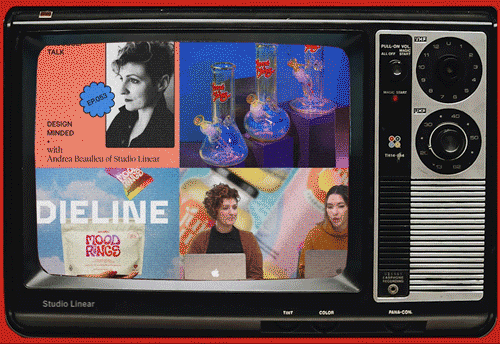
Dieline Feature - Hey Binx
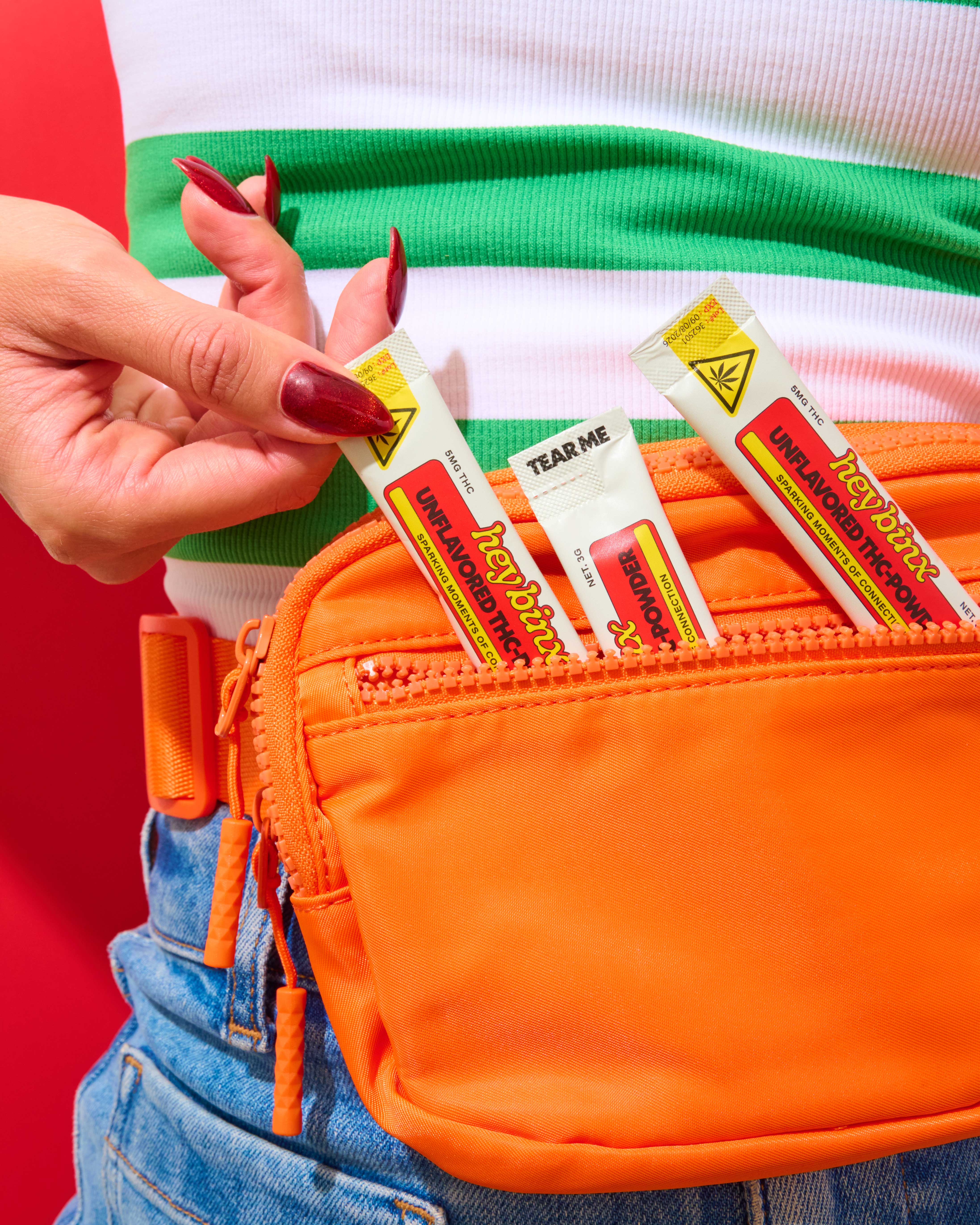
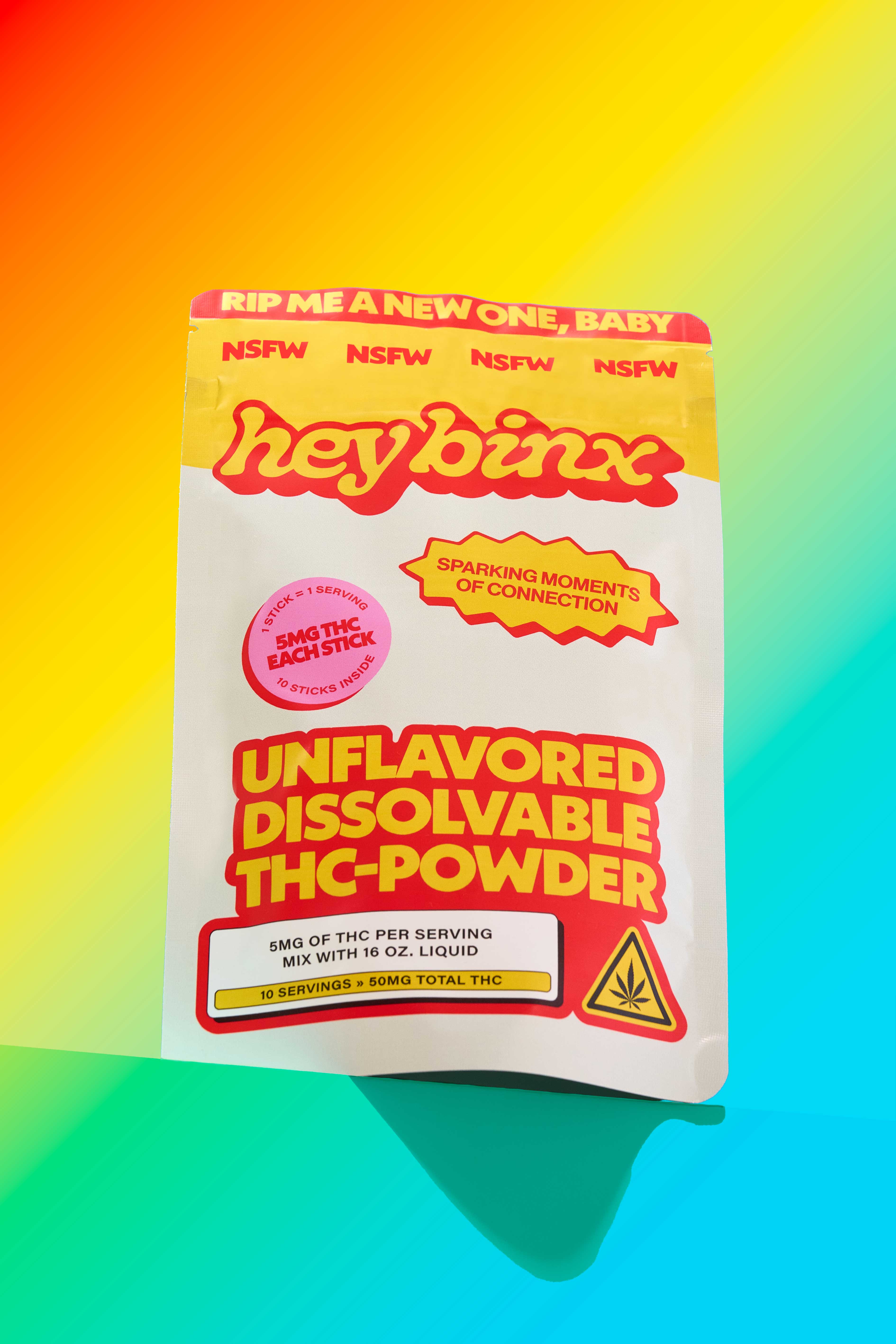
Hey Binx’s THC Powders Are Unapologetically Loud
Hey Binx’s packaging, courtesy of Studio Linear, opts for a pop-maximalist approach for its THC powders. Bubble typography nods to 70s branding and underground comics, while high-contrast gradients and candy brights reference rave flyers and early internet graphics.
Cartoon icons and blunt instructional panels borrow from consumer warning labels, turning regulation into anything but a design constraint. I love when cannabis packaging plays into all the cliches, and Binx has done it without feeling like it’s the butt of the joke.
Andrea Beaulieu, founder and creative director of Studio Linear, details the design process below.
How did you decide on the playful, bold tone (colors, typography, and copy like “RIP ME A NEW ONE, BABY”) and how does it align with the brand’s target audience and values?
In cannabis branding, we’re often asked to create something “elevated” or “timeless,” usually as a way to distance the brand from hippy or stoner stereotypes. Jill gave us a rare creative green light to do the opposite—to be loud, vulgar, and unapologetic. That freedom allowed us to fully lean into a tone that favors confidence over caution.
We intentionally paired colors that technically shouldn’t work together and typography that feels aggressive and audacious. The copy was written to provoke a reaction, not universal approval. The goal wasn’t to be liked by everyone, but to be impossible to ignore. That attitude aligns directly with the brand’s values: bold, irreverent, and unafraid to take up space in a category where many brands still feel hesitant.
What was your approach to balancing eye-catching graphics with critical information like dosage, warnings, and usage instructions so nothing important gets lost?
Delta-9 and THC solubles are still relatively new categories for many consumers, which means there’s a lot of education required. The challenge is that “important” information often becomes invisible when it’s presented in a dry or overly clinical way. Our approach was to treat education as part of the entertainment.
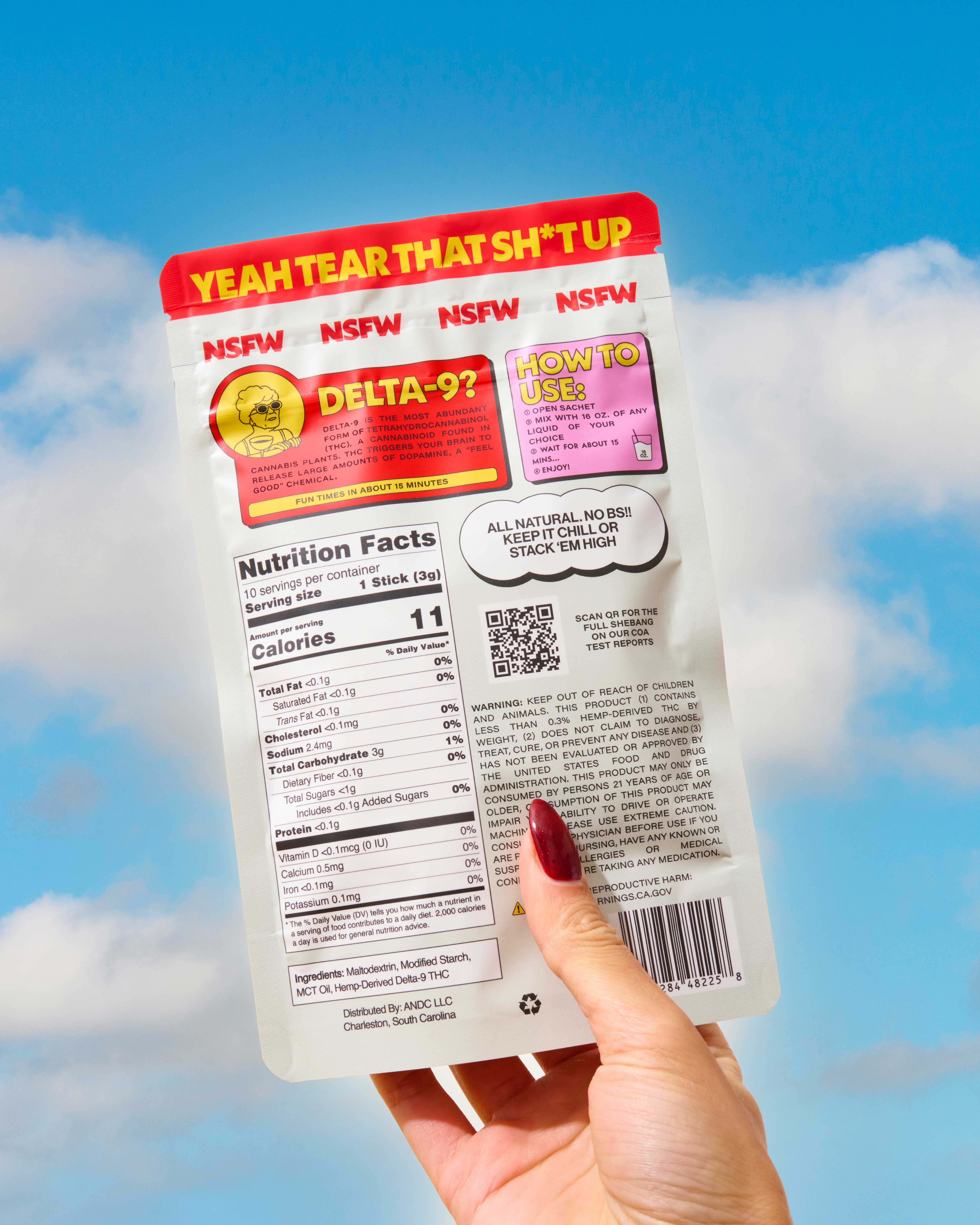
Rather than hiding dosage and instructions in small print, we made them loud and visually engaging—almost provoking the consumer to read them. The dope grandma mascot acts as a guide, explaining how things work in a way that feels humorous and approachable instead of instructional. By merging wit with information, we made sure nothing essential gets overlooked while keeping the experience fun.
How did legal and compliance requirements (THC warnings, nutrition facts, age restrictions) influence the layout and aesthetic choices of the packaging?
Compliance in THC packaging is rigid, and there’s no way around that. Instead of treating legal requirements as a visual burden, we treated them as another opportunity to reinforce the brand’s voice. Since the brand is rooted in being playful, bold, and in-your-face, the compliance elements followed the same logic.
Warnings, age restrictions, and required information were designed to be prominent rather than minimized. Even the cheeky NSFW zip-lock banner functions as both a legal warning and a brand statement. By integrating compliance into the visual language instead of fighting it, the packaging stays cohesive while still meeting the regulatory requirements.
Do you mind sharing your favorite part of the overall design and why?
Ironically, it’s the warning labels. The fact that the top of the package immediately screams “NSFW,” paired with copy like “RIP ME A NEW ONE,” makes it impossible to ignore on shelf. It’s confrontational and sets an immediate first impression.
We also love that the back of the package is just as engaging as the front. Often, the back is treated as purely functional, but here it becomes part of the experience. That balance—where even the most regulated, restrictive elements still feel iconic—is what makes the system feel complete. We absolutely love the sassy granny that is featured in this brand as well!
When designing this packaging system, what competitive products or visual tropes were you intentionally trying to stand apart from, and how do you think this packaging performs at first glance on a crowded shelf?
We were intentionally designing against two common approaches in the category: the expected hippy-leaning visuals and the newer wave of overly minimal cannabis brands that equate quietness with credibility.
This packaging does the opposite. It’s defiant, confrontational, and doesn’t ask for permission to be seen. At first glance on a crowded shelf, it sparks curiosity, sets a clear tone, and promises a good time. It doesn’t try to blend in or explain itself too much—it shows up, says exactly what it is, and lets the consumer decide from there.
.png)
.png)
.svg)


.svg)